Highlands Ave W3
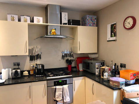
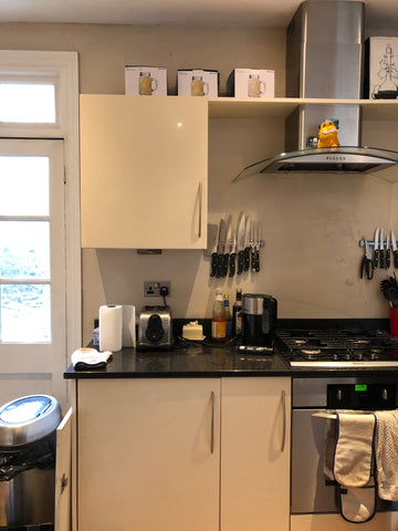
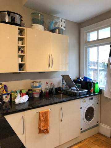
This Bachelor pad was in dire need of updating, and my gentleman client had a tight budget but we managed to transform this student dig into a proud place to bring friends and entertain. The kitchen was the priority which took up the majority of the budget. I explained that once we'd completed that room, the rest of the flat would look worse than it does now so it really needed to be addressed as a whole. We could break it down into stages to help with cash flow, but the building work needed to be done all at the same time to keep costs down. We could stagger the arrival of furniture but it's important to get the bones of the building done properly. If we are moving radiators and electrical sockets in other rooms, it was best to get done all the same time.
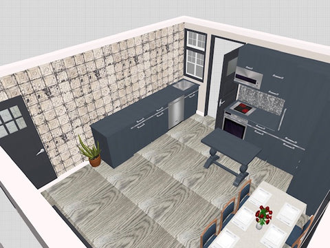
Render showing the colours and new layout. Keeping utilities in the same place to keep costs down, I came up with this design. Eliminating wall units that obstruct your eye line, this opens the kitchen up and allows you to see into the garden from the door. Making use of the full height in the right corner, we placed the fridge and larder units to maximize storage and to keep the working triangle tight. The client didn't want an island but I've shown a freestanding one that can be moved to the side when not in use.
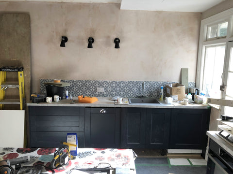
Client didn't go for wallpaper in the end due to budget, but we chose these wall lights to add interest and task lighting (wall to be painted...) Clearly not complete but shows the bank of new units and the wall free allowing eye line down to window from door. Splash back tiles 'fleur' from Topps Tiles add some pattern.
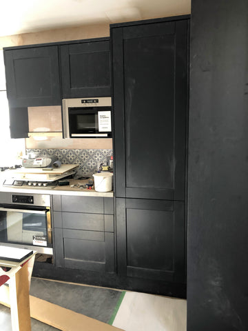
Clearly not finished but this shows the kitchen maximizing this tall corner area and offering the most storage space in the areas that allow it.
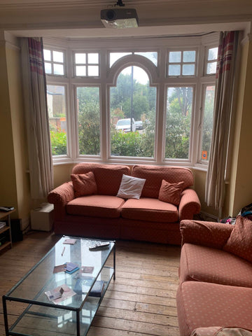
The living room needed a new fireplace, floor, joinery either side of the fireplace to create storage, paint job and curtains. The inherited furniture was tired and dated, and not enough seating for the number of friends he liked to entertain. This was a challenge as one wall was used as a screen so anything placed in front of this needed to be shallow.
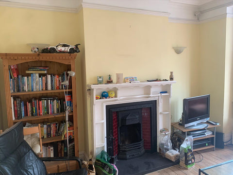
Living room BEFORE
Suggested furniture for client, a 3 seater velvet sofa, 2 seater leather sofa and blurred lines rug
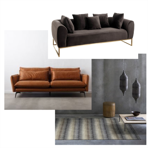
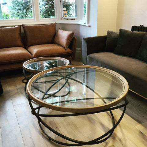
These sofas were inexpensive, comfortable, maximized the space which allowed 5 people to sit instead of 4, masculine and modern. The coffee tables can be moved around the circular design creates flow and movement, and takes up less space than a large rectangular table. I particularly like the metal, wood and glass together.
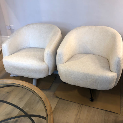
I love these swivel chairs and they offer some low, occasional seating when entertaining.
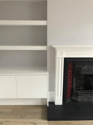
BEFORE shot of the fireplace wall - needing joinery either side and a new surround.
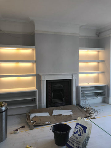
New paint job and joinery (nearly done) with LEDS in each shelf
Completed joinery with new surround
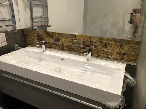
The bathroom had no storage and desperately needed updating. No before shot but we managed to salvage the mirror to save money and add a double drawer sink unit to maximize the space available. previously there was a single sink. Once old was removed, a brick wall was revealed which we decided to keep and make a feature of.. Towel rail was moved up and on the left for practical reasons.
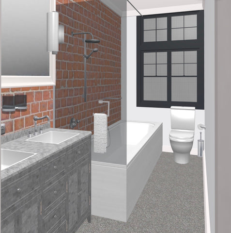
Render showing exposed brick wall to help client imagine the outcome.
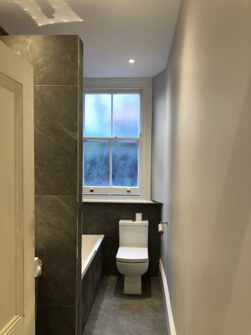
Previously towel rail was on the right on wall when you walked in which was unsightly and in the way, it narrowed the entrance and was always going to look messy with a towel tucked into it, so we moved behind the door, above and to the side of the sink (above) Now this wall is clear and appears wider than before.
This project started in August 2020 and completed in November, it is yet to be photographed professionally due to Covid and lockdown.